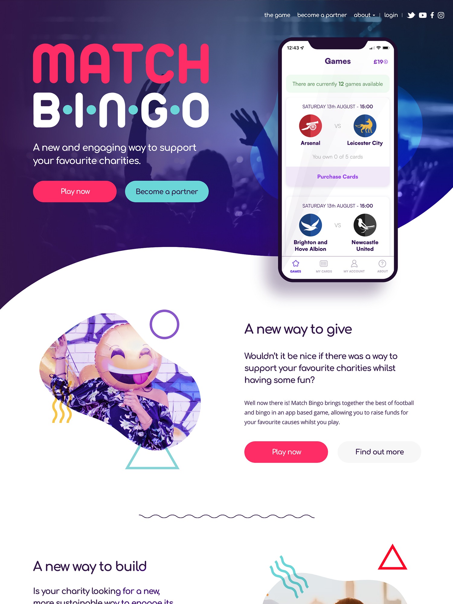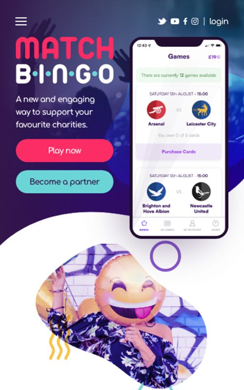

Match Bingo provide a new way to give to your favourite charity through combining sports based games and giving. They asked us to build a website with two primary functions, promote their games to their audience and inform and encourage potential charity partnerships.
Features
- Bold design for maximum impact
- CSS powered image styles
- Custom backend interface for layout flexibility
Designing a fun and flexible Match Bingo site
Aside from a logo and some colour ideas, the Match Bingo brand was fairly open to interpretation. We wanted to design a site that was bold, fun, colourful and provided the flexibility that the team needed to grow over time.
We combined sweeping, curved lines with bold, colour treated imagery to create a site that feels fluid and fun but also achieves it's key objectives.
Using clever CSS to create visual interest
The image style we designed consisted of irregular shapes surrounded by coloured circles, triangles and waves. However, we didn't want the Match Bingo team to have to try and recreate this aesthetic every time they wanted to add or replace an image.
We decided to use css so that any image styling was applied on the front end. That way the team could upload a conventional image and all the required styling would be applied by a combination of svg masking, positioned shapes and css blend modes automatically.
Showcasing the games
We wanted to find a way to show users how the games worked in as simple a way as possible. We developed an interface that allowed the team to create step by step guides that were easy to add from a backend perspective, but rich and interactive on the frontend.
Custom website theme
Design focused
Custom functionality
Engagement & Support
Responsive layouts
Custom home page
Need help with a project?
Fill in the form below and we’ll get in touch to discuss your needs.

