
Arts Council England are the national development agency for creativity and culture. They wanted to redesign their Arts Jobs website, a place where people can shares adverts for a range of opportunities and events within the arts sector.
For this job we worked alongside web development agency Net efficiency, with The Space Room handling design and Net Efficiency handling the backend work. Frontend development was split between us both.
Features
- Better job and event posting process
- Improved search functionality and interface
- Site restyle for clarity and professionalism
- Improved user experience and flow through site
A new look for Arts Jobs and Events
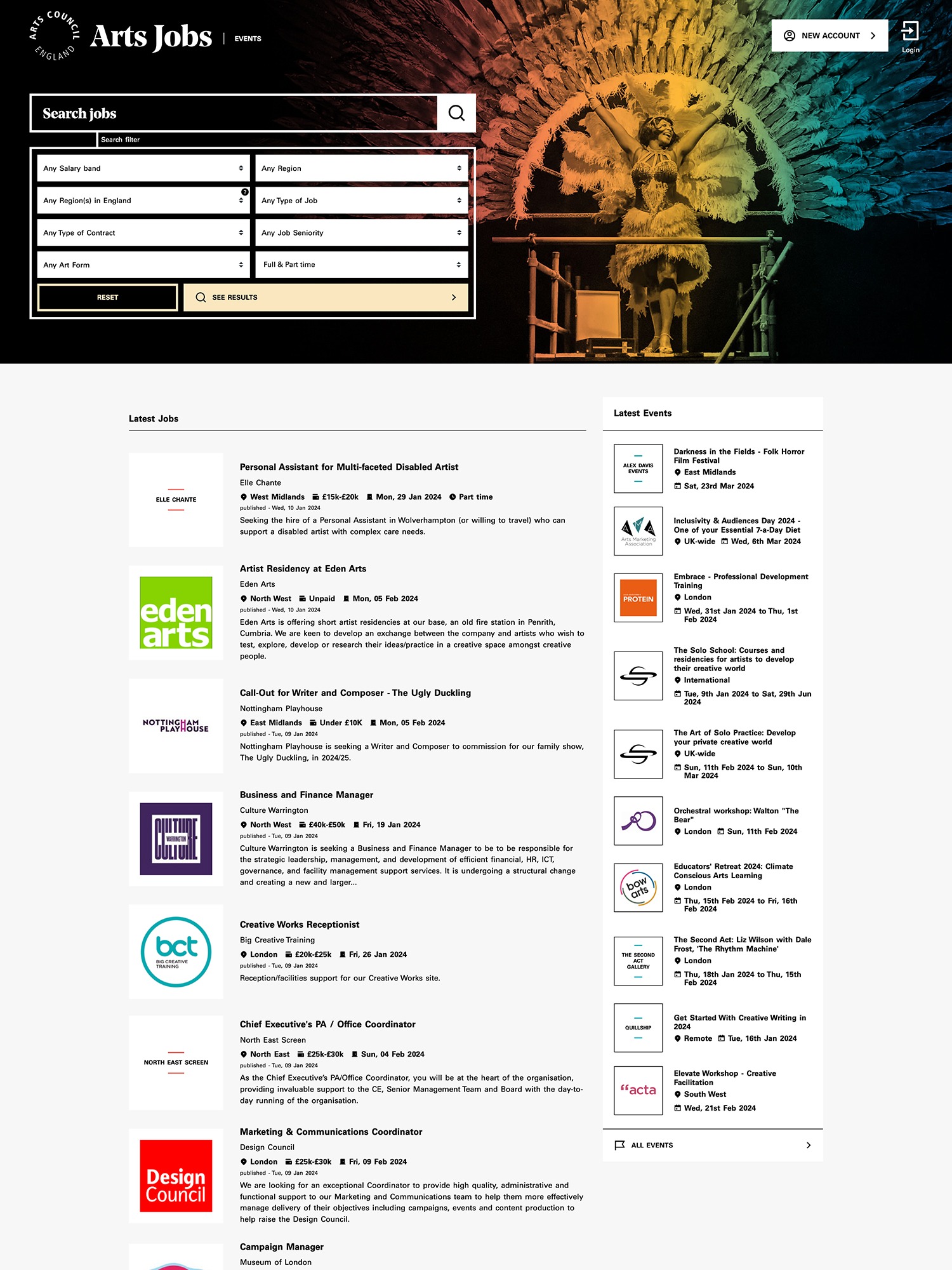
The old Arts Jobs site was looking a little tired and in need of a refresh. We updated the colour scheme and typography and used bold, colourised imagery to bring the site to life. A large portion of our design time was spent making interface elements as clear and intuitive as possible so that adding and searching for listings was a seamless process.
An improved search interface
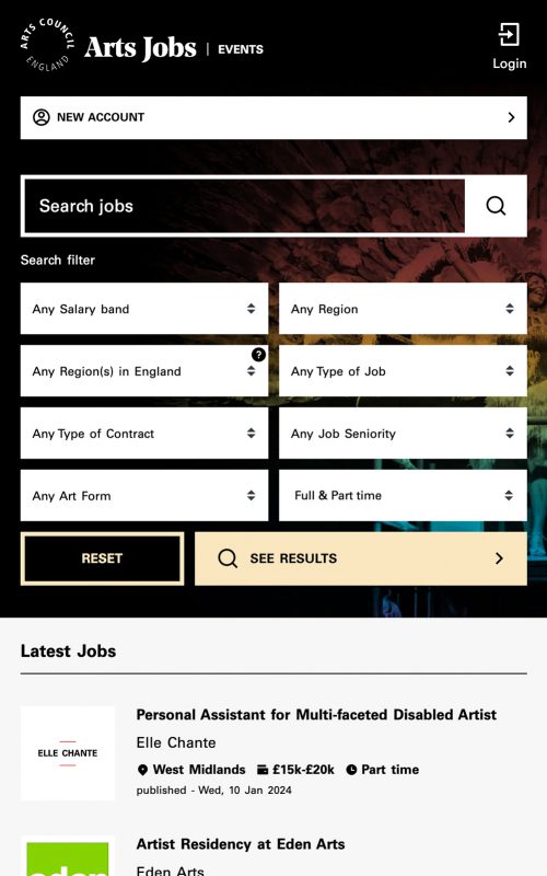
One of the main challenges with the Arts Jobs redesign was making it as easy as possible for users to find relevant listings. With this in mind we spent a long time designing a new search filter which allowed for multiple, nuanced criteria, but didn't take up huge amounts of space on the page and overwhelm the user.
We paid particular attention to how the search form would appear at different screen sizes. For instance, on mid size screens the search form could be toggled into view when needed in order make reading listings easy when screen real estate was at a premium.
Improved listing layouts
On the old Arts Jobs site listings were created using a free text field and there was no guidance for a poster on how best to structure their advert. This meant that there was a lack of consistency both to the quality of the adverts and to the way they appeared to viewers.
We created a more comprehensive listing form that encouraged a thought out approach to putting together an advert. We broke the listing down into sections which meant the poster had more guidance as to what information would be useful, leading to much better quality adverts, which in turn could be displayed more clearly on the frontend.
Accessibility at its core
One of the primary requirements for the new Arts Jobs site was making sure it was accessible to all users, regardless of their needs.
To ensure this we designed with accessible colour schemes and typography in mind at all times. Testing combinations for legibility at all stages. We also worked with a screenreader to make sure all aspects of the interface were clear and navigable and intuitive for blind and partially sighted users.
Arts Jobs features
Full redesign
Reworked interface
Custom functionality
Constant dialogue with client
Responsive layouts
Custom home page
Email templates
Events functionality
Social Media Sharing
Newsletter sign up
Membership
Need help with a project?
Fill in the form below and we’ll get in touch to discuss your needs.

